Project Type
My Contribution
Overview
To alert or not to alert, that is the question.
Split is a feature delivery platform which enables users to
measure the impact of released features on their customer experience metrics. Causal alerting is a
crucial differentiator for us in the market. However, as of July 2022 less than 10% of our users are
actively using this main capability.
In my role as an embedded designer within the Measurement and Learning team, we embarked on a
journey to investigate the current issues and explore ways to enhance the usability of the alerting
feature.
Let’s dive in! Not to spoil anything but this story comes with a twist....
The way it was
How might we improve the usability of our alerting feature
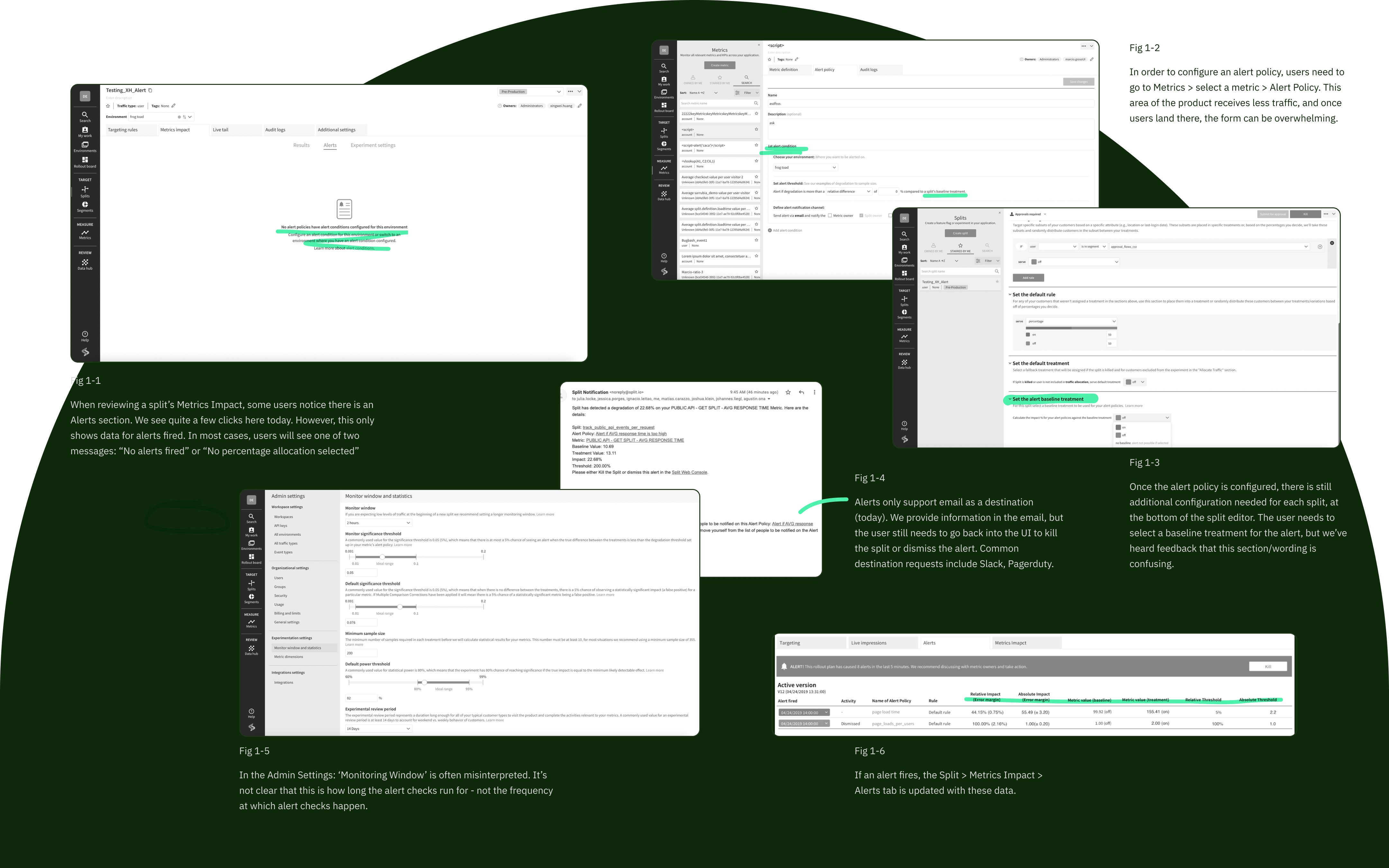
Through discussions with customers and internal teams, anecdotal feedback
indicated that the perceived value of causal alerting
resonates strongly, but a bumpy experience prevents customers from realizing the actual value. Below
are some of our preliminary observations on the usability issues.
Foundational research
Zooming in
In order to get a clear picture of the current experience
and to test our hypothesis. We conducted twelve user interviews, here are some pain points
we've gathered. They can be mainly categorized into three buckets :
User personas
Key user segments -- who are we designing for
Then we created two general user personas that represent the key user segments we've identified:
users who use Split as an experimentation tool, and others who use Split as a
feature flagging tool.
Journey mapping
Current state VS new potential
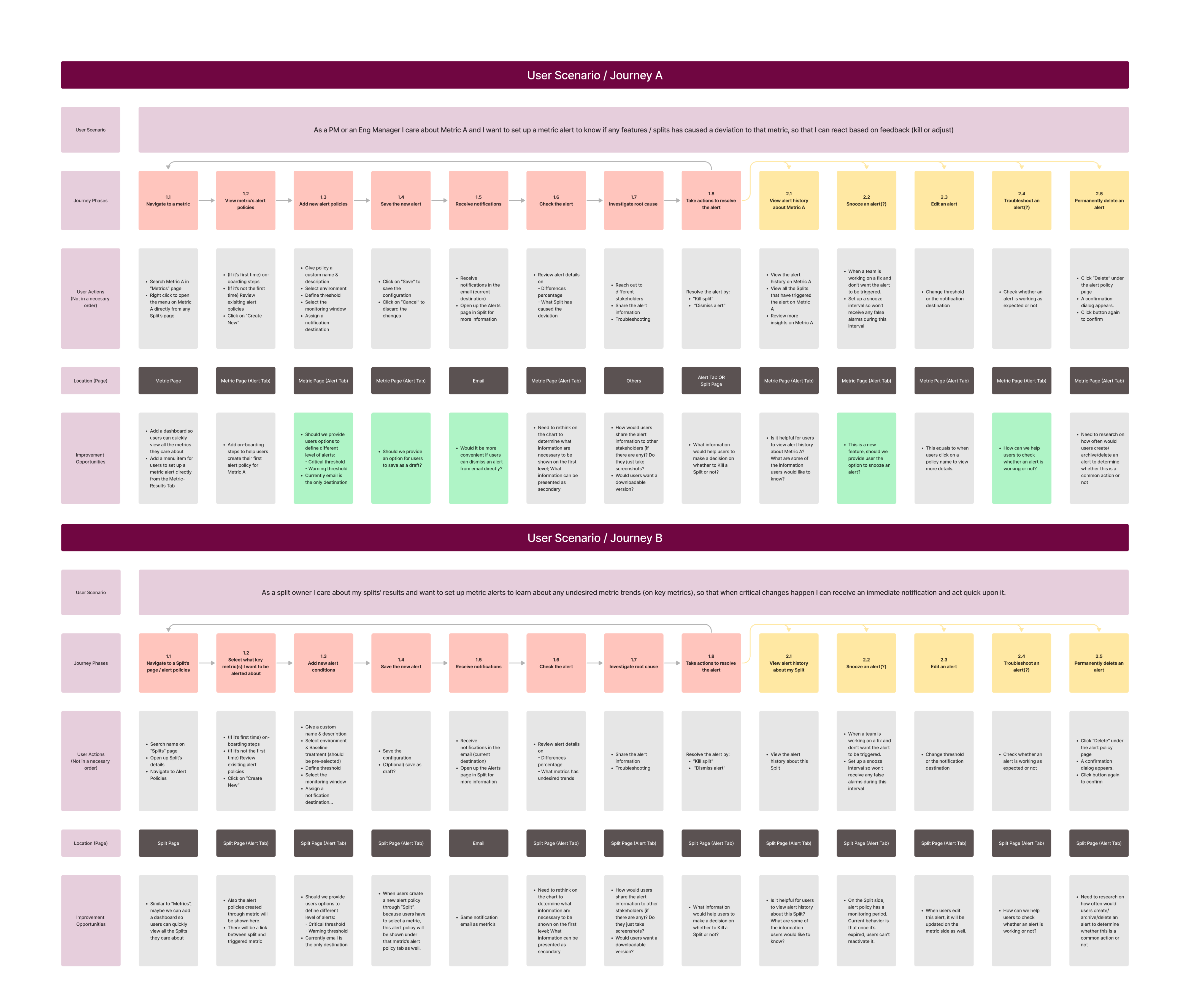
After mapping out the user journey for both A and B personas, I realized that we are currently
compelling them to use the same interface. Although the goals of these two personas overlap,
they are not identical. Therefore, the current flow isn't efficient for either persona.
Task analysis
Efficiency through step by step
Then I took a closer look at the desired outcomes for each persona, examining the underlying goals
driving these outcomes. To achieve these goals, users must complete multiple steps (individual
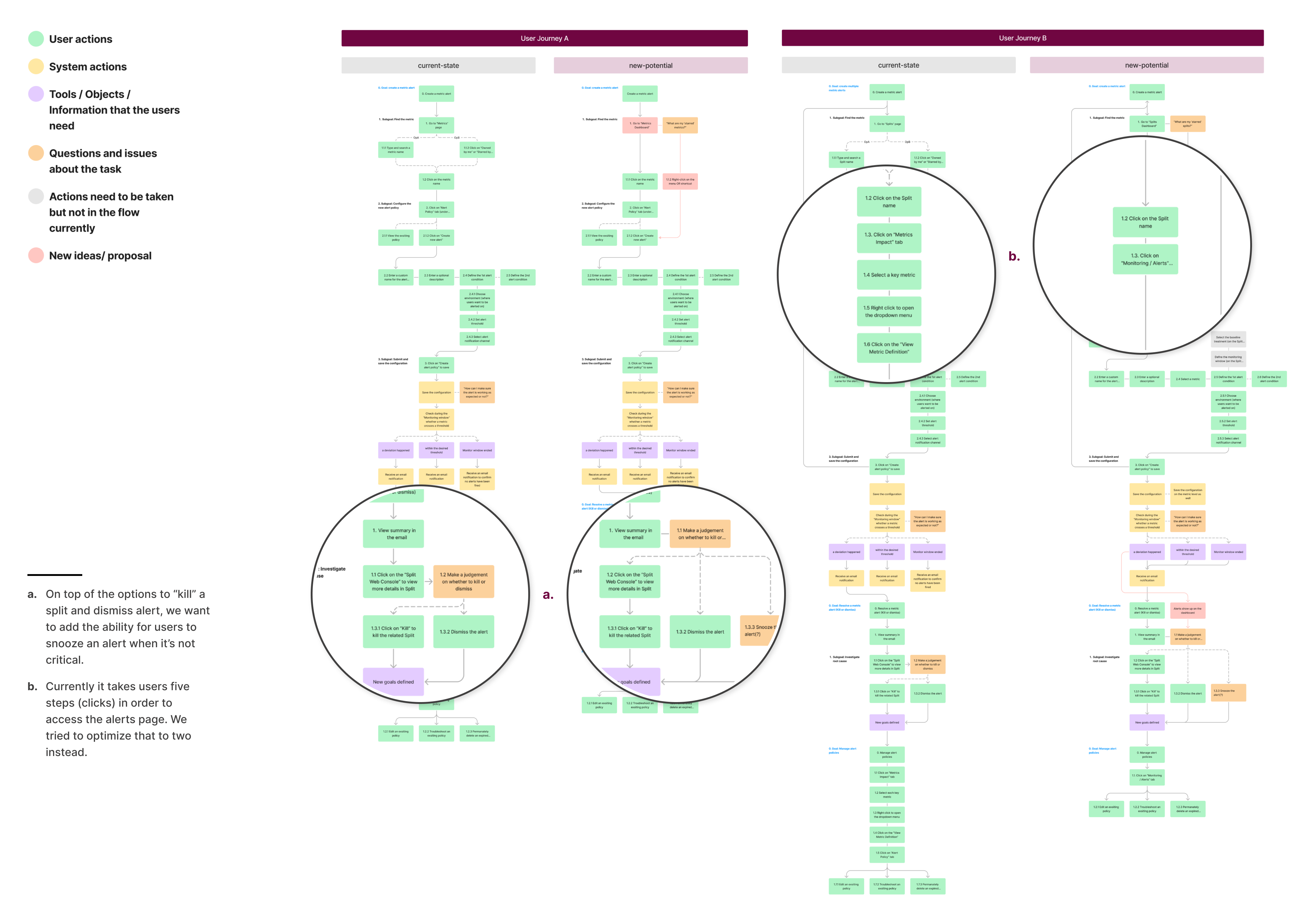
tasks). Through task analysis, I identified numerous steps that can
be simplified or replaced through automation.
In the image below, the chart on the left represents the current steps
users need to go through. In comparison, the 'new-potential' chart contains fewer steps and requires
less user input.
Measuring success
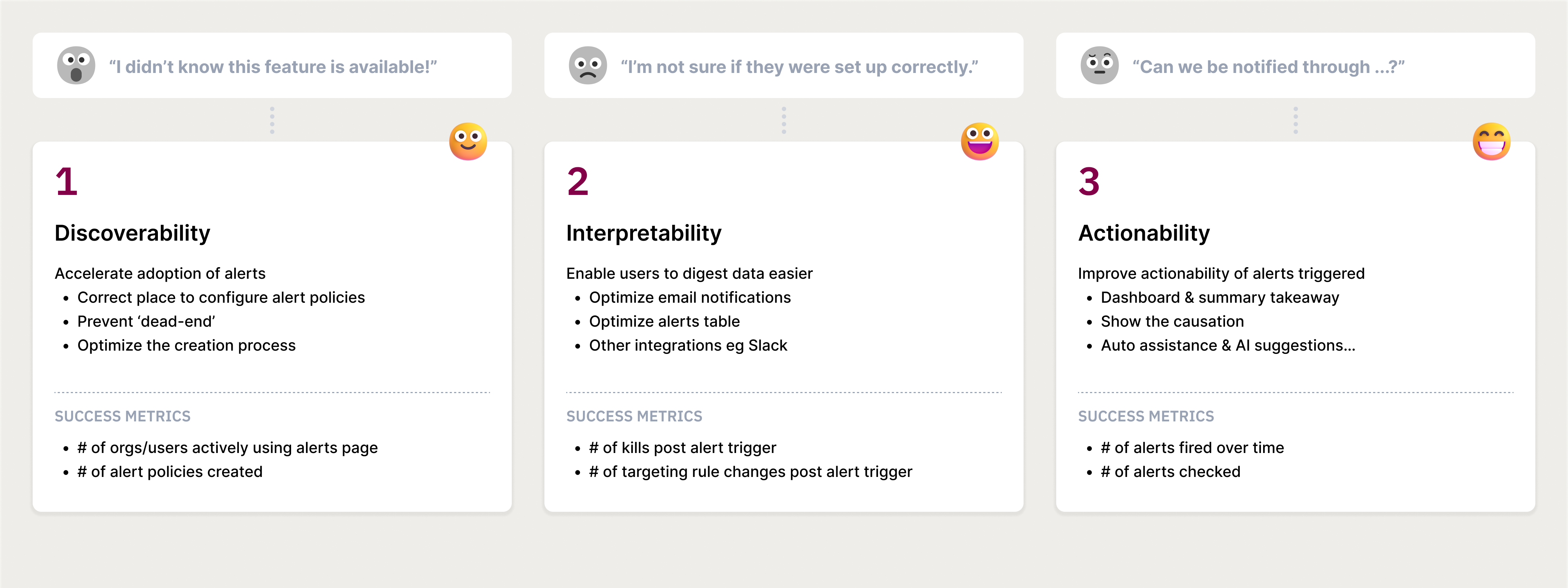
What success look like
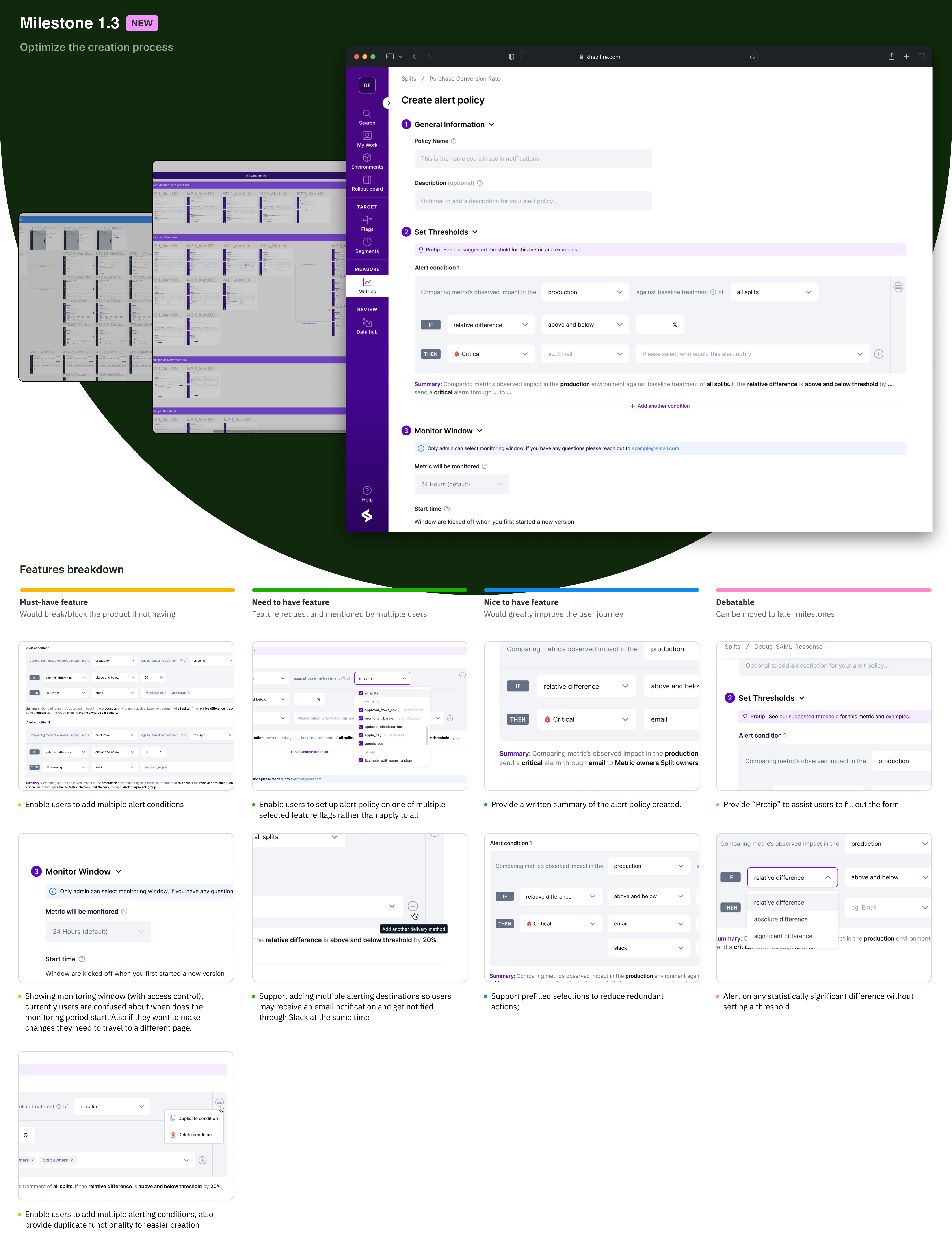
Knowing where the problems are, we started to draft a three-step milestones
plan.
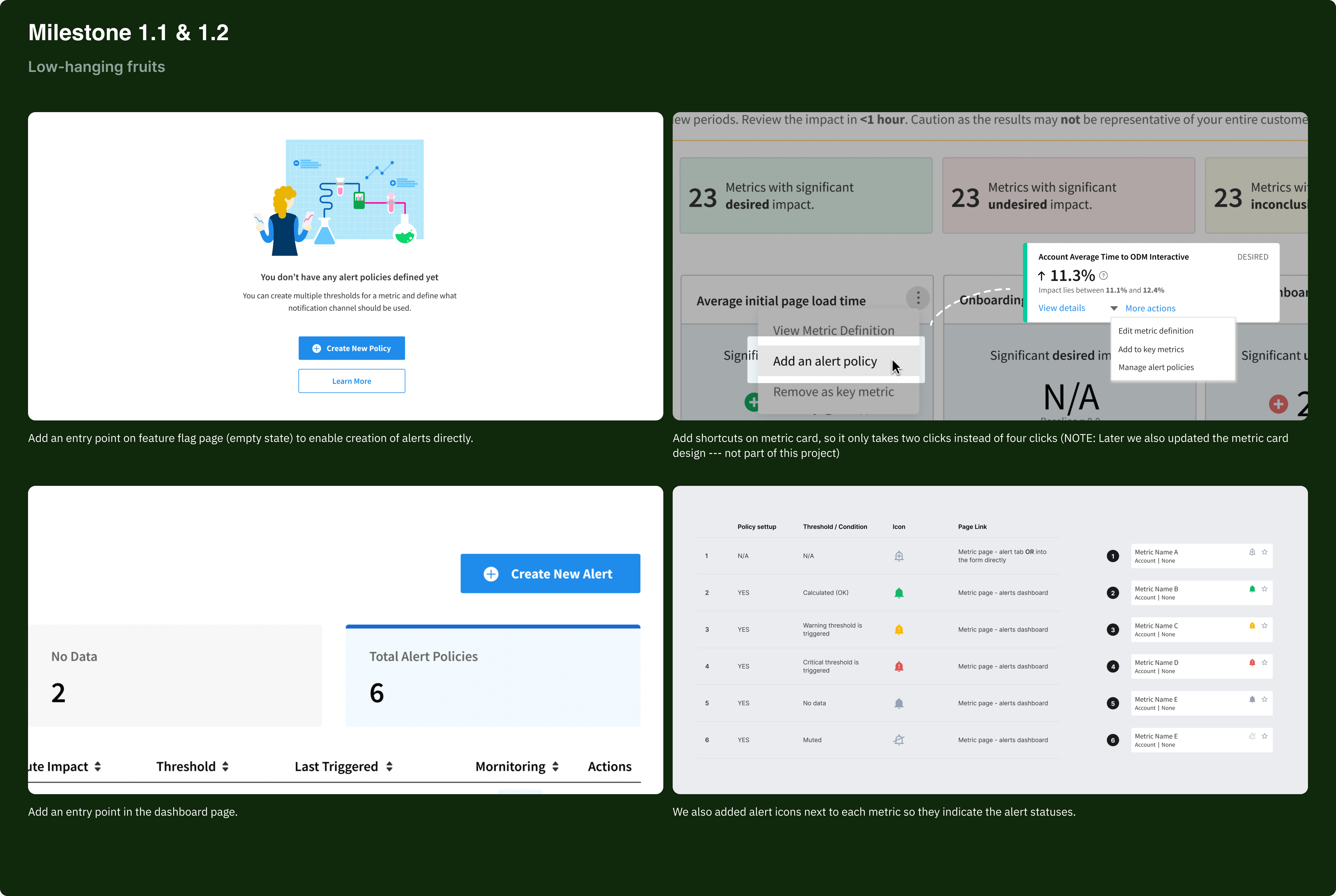
Milestone One
Low-hanging fruits
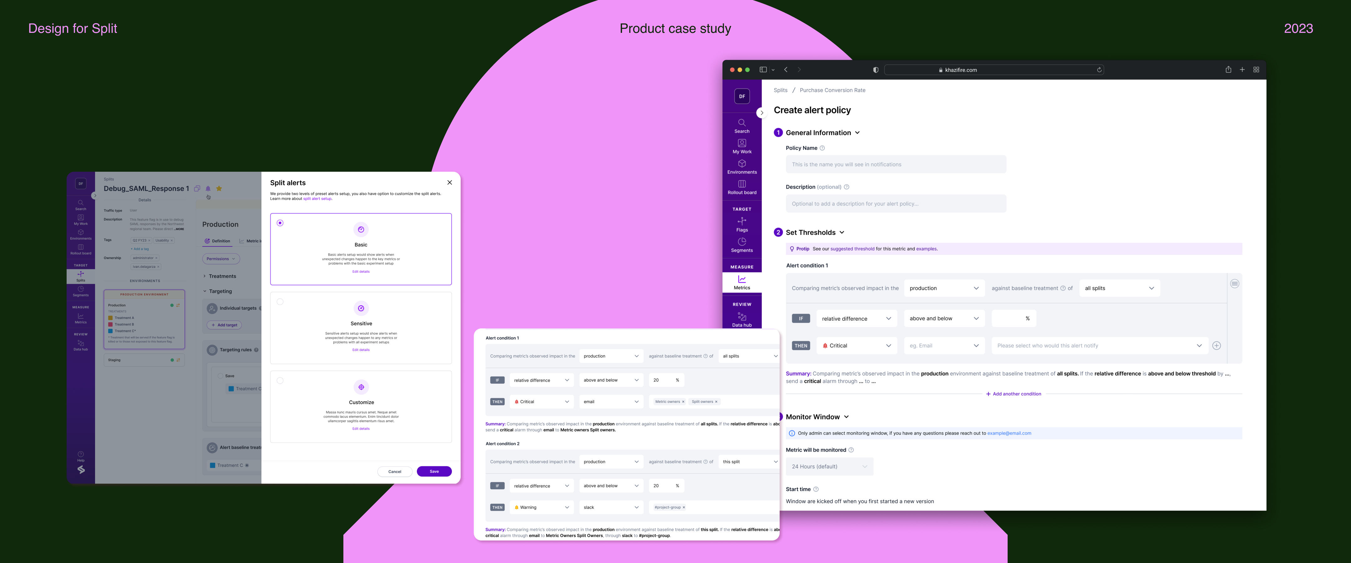
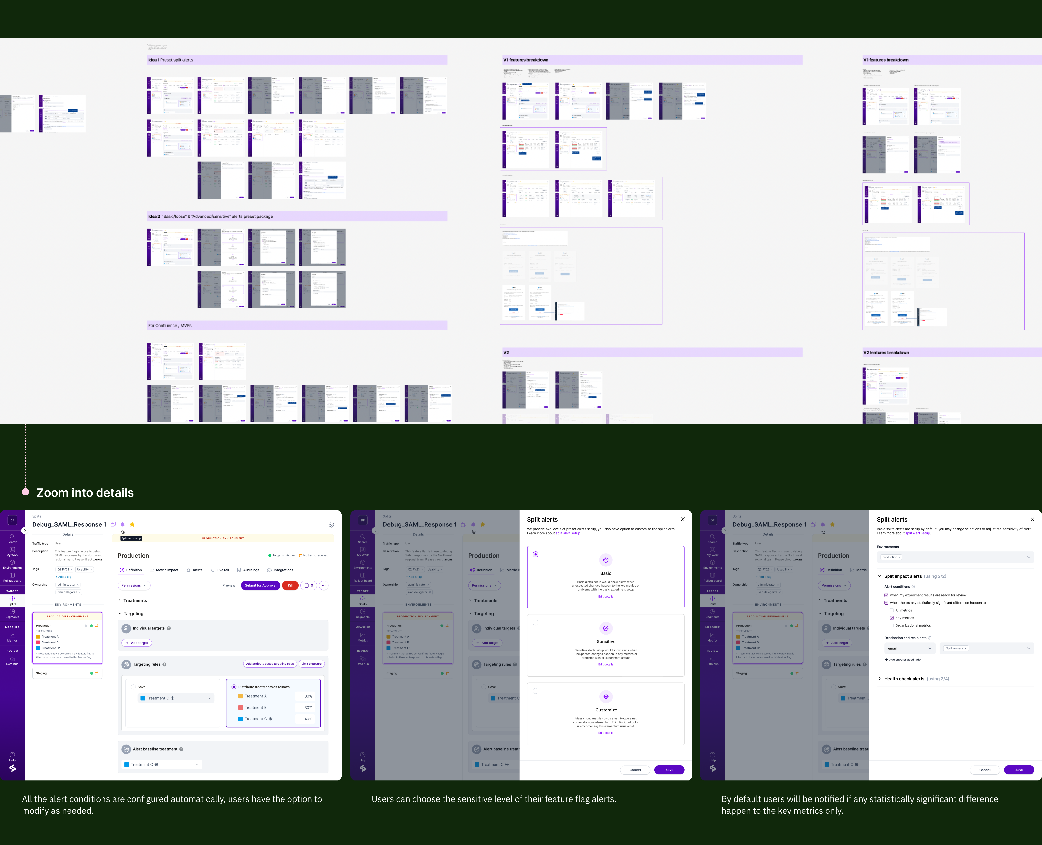
As our first step to enhance the discoverability of the alerting feature, we
added entry points to the creation flow to prevent 'dead-end' scenarios, significantly improving the
click rate on the alert policy page.
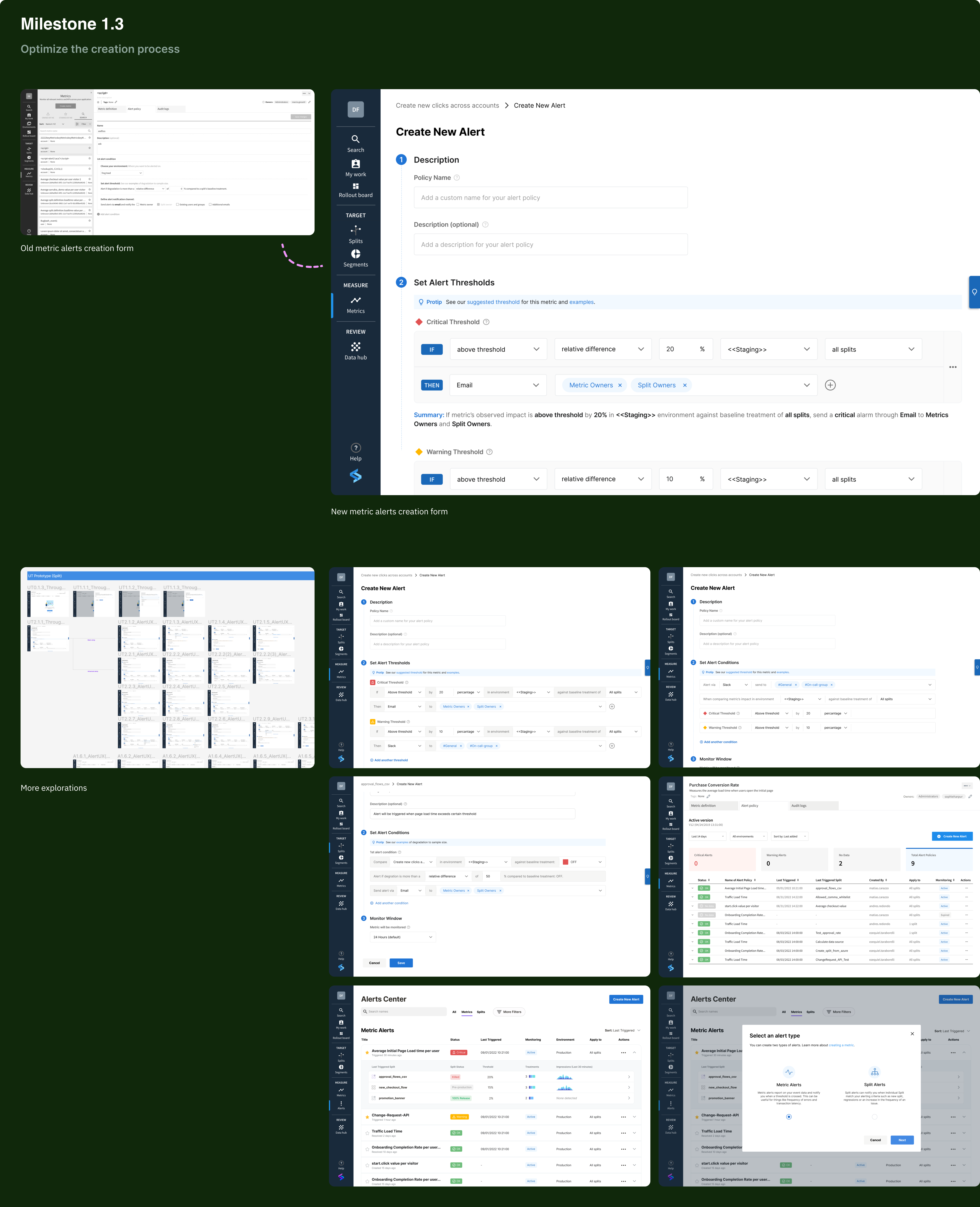
However, help users to discover this functionality is just the first step. The most challenging
aspect of optimizing the creation process is enhancing the configurability of alert
policies and
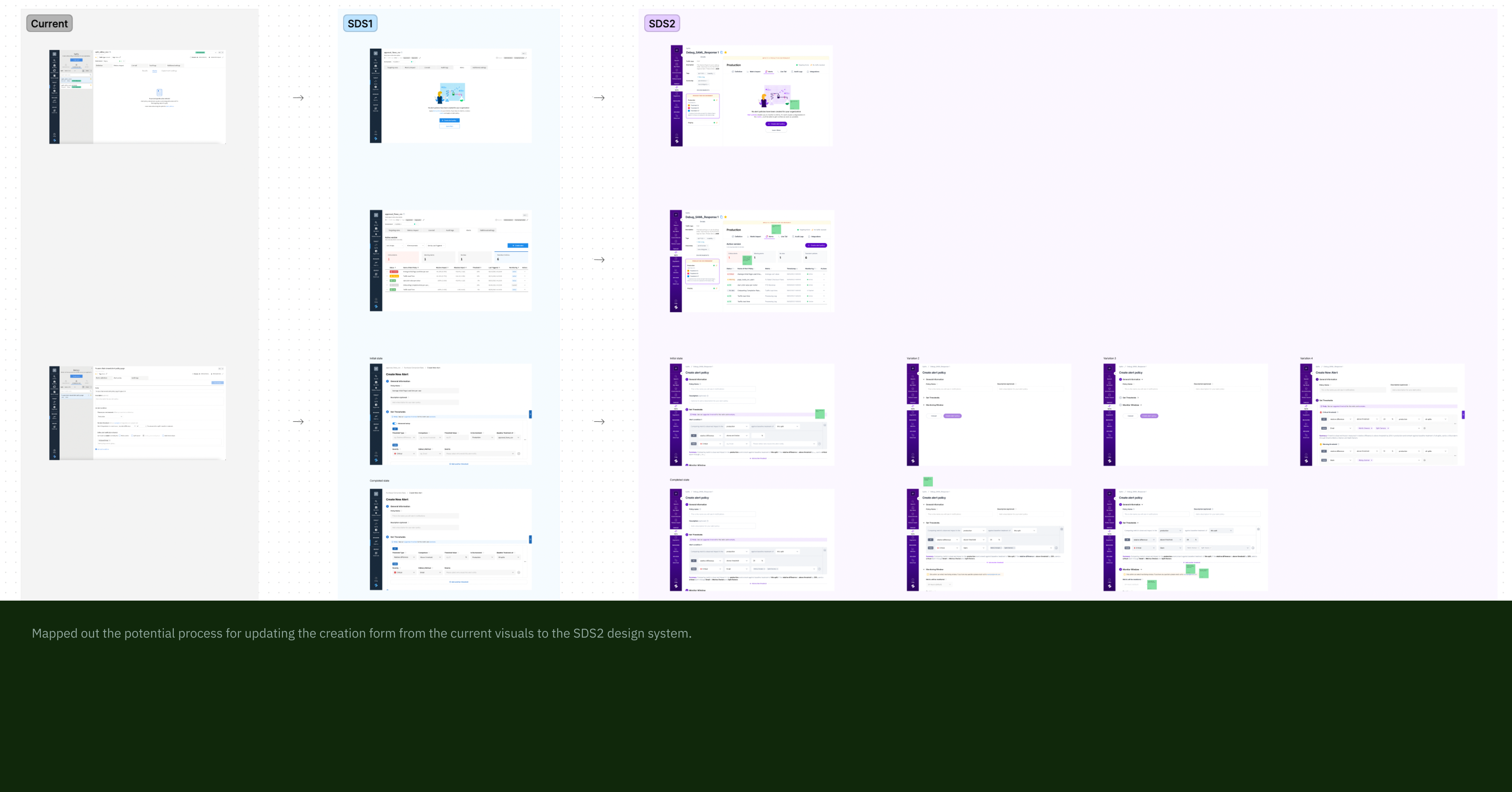
simplifying the setup of alerting conditions for users. With this goal in mind, I
continued
exploring various form designs...
Outcome
Post-launch feedback and next steps
After working closely with engineering team to bring designs to life, we
launched Milestone One. The automation of feature flag alerts set up has significantly increased the
click rate and the percentage of unique users who engaged with our alerts tab.
Meanwhile we have clear plans for improving and expanding the alerting
features in the future. The next milestones include supporting intelligent alerting threshold setup,
shortcuts, and metric dashboard view. We are currently working on implementing these
suggestions to further improve the user experience.

Learnings
Looking forward
By listening to our users and making changes that provided real value to
them, we created a dynamic alert creation process with improved capabilities. I
grew as a designer and walked away with a few key takeaways:
-
Identifying and pursuing low-hanging fruit can be fruitful.
By prioritizing these accessible opportunities, the team can demonstrate
tangible progress. This will not only results in immediate wins but also sets a positive tone
for ongoing design efforts, encouraging a mindset of continuous improvement and innovation.
-
Thinking and designing with a systems mindset is a great way to
achieve flexibility.
A systemic approach fosters modularity and interoperability, allowing for
seamless adjustments and updates. This not only streamlines the design process but also empowers
the product to evolve alongside changing requirements.
-
When the initial approach encounters challenges, it doesn't
signify the end of the world.
Instead, it opens the door to valuable learning and adaptation. In the
face of setbacks, the key is to view them as stepping stones toward a more refined and
innovative design.
